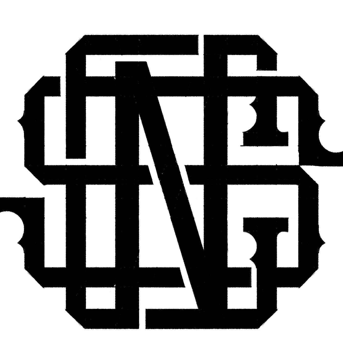


Kabarkyaw Logo Refresh
Kabarkyaw is a well-established producer of local Myanmar snacks, renowned for its iconic Sarkalay Snack. With a strong presence in the industry, the company aims to enhance its brand identity through a logo redesign while maintaining its existing recognition and reputation.
The primary objective of this project is to refresh the current logo without making significant alterations that may disrupt the established brand image. The new logo should uphold the brand's heritage and familiarity while providing a modern and polished look. It is crucial to strike a balance between maintaining the original essence of the logo and introducing subtle enhancements for a refreshed appearance.
The design direction for the new logo should focus on refinement and sophistication. While preserving the key elements of the original logo, such as the typography and emblem, the emphasis should be on creating a clean and polished finish. Avoiding overly intricate or cluttered designs is essential to ensure that the logo remains easily recognizable and versatile across various applications.
Key Considerations:
-
Maintain brand continuity: Retain core elements of the original logo to ensure continuity and preserve brand recognition.
- Subtle enhancements: Introduce minor updates or refinements to modernize the logo while respecting its heritage.
- Clean finish: Strive for a clean and polished design that reflects professionalism and sophistication.
- Versatility: Ensure that the new logo is versatile and scalable for use across different mediums and platforms.
Challenge & Solution
Balancing Familiarity with Modernization: Ensuring that the updated logo maintains enough resemblance to the original to retain brand recognition, while also introducing subtle modern elements to keep it relevant and fresh.
Achieving Clean Finish: Creating a polished and refined design that meets modern aesthetic standards while avoiding clutter or complexity that could detract from the logo's impact and versatility.
Final Result
The final result of the Kabarkyaw logo redesign is a refreshed and polished version of the original logo, carefully balancing modernization with brand continuity. The updated logo maintains familiarity with subtle enhancements, ensuring it remains easily recognizable while appealing to contemporary aesthetics. With a clean and refined finish, the new logo reflects professionalism and sophistication.
Chan was very attentive and active to listening my specific requests for the logo design. And I am very happy with his work. Thank you so much.
Aster @KabarKyaw
Category:
DEVELOPMENT
Software:
ADOBE PHOTOSHOP, PROCREATE, ADOBE ILLUSTRATOR
Service:
LOGO DESIGN
Client:
Kabarkyaw
Date:


