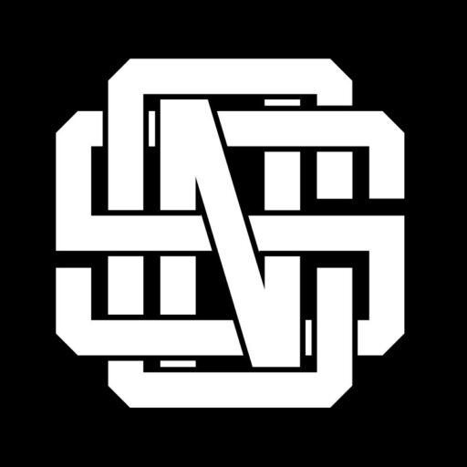
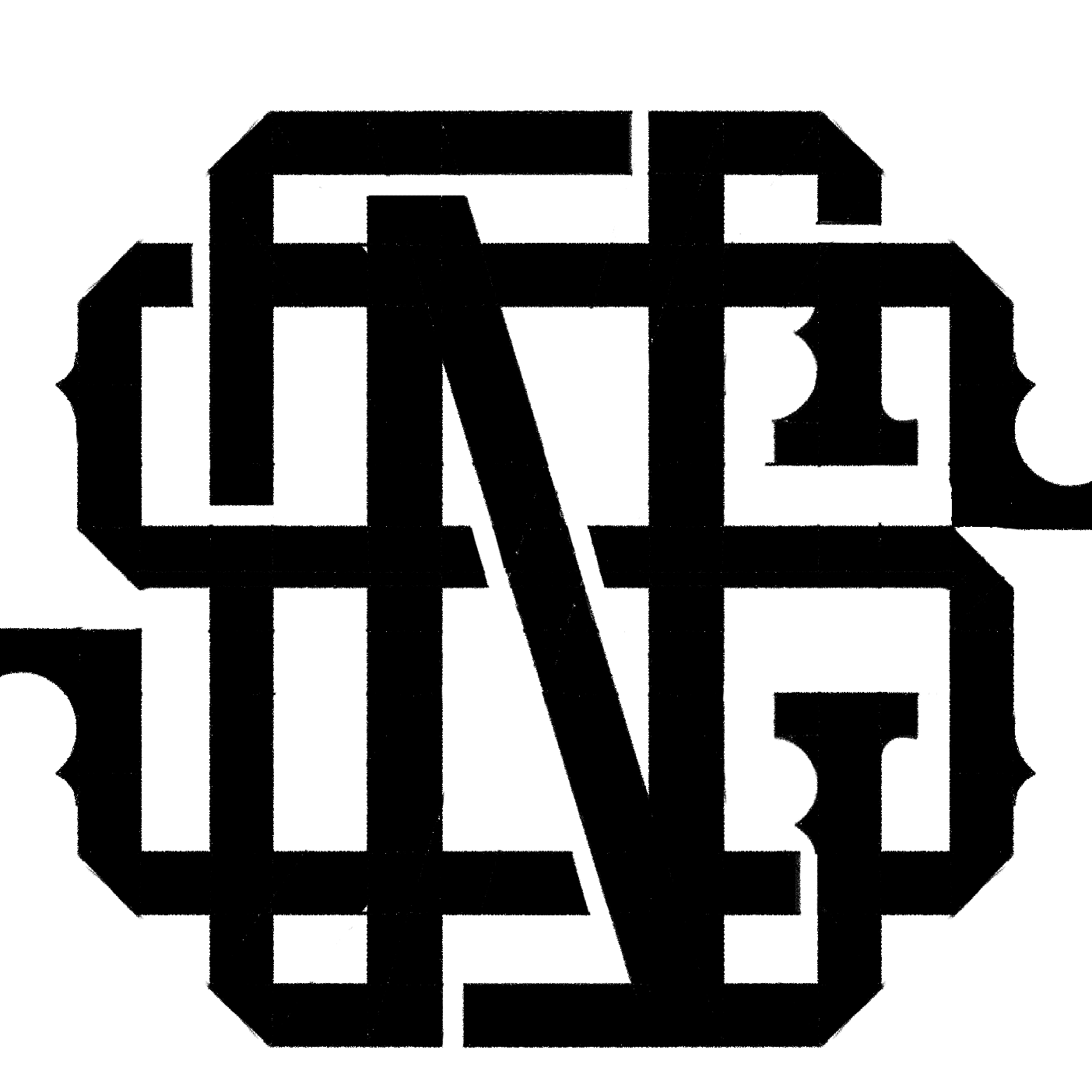
Maxtor Logo Design
Maxtor PowerPro Solutions, a subsidiary of Maxtor Co., Ltd, specializes in providing innovative power solutions and services to clients. Founded as part of the multifaceted enterprise in December 2015 in Myanmar, the company is committed to delivering superior quality and exceptional service across various sectors. Maxtor PowerPro Solutions is seeking a new monogram logo, MPPS, to represent its brand and dedication to excellence in its offerings.
The primary objective of this project is to create a monogram logo for Maxtor PowerPro Solutions (MPPS) that aligns with the company's image as a professional, high-quality, and innovative provider of power solutions. The logo should reflect the brand's commitment to excellence and modernity.
- Monogram Style: The logo should be a monogram that incorporates the letters "MPPS" in a cohesive and recognizable design.
- Clarity and Readability: Ensure the logo is easy to read and instantly identifiable as "MPPS."
- Professional Appearance: The logo should convey a sense of professionalism and expertise, suitable for a company that offers advanced power solutions.
- Color Scheme: Utilize a blue color scheme to reflect trustworthiness, reliability, and modernity. The shades of blue can range from dark navy to lighter tones for visual interest.
Challenge & Solution
One of the challenges that I faced while creating this logo is designing a monogram that is visually appealing while maintaining clear legibility of the letters "MPPS" can be challenging.
Integrating the four letters in a way that is visually appealing while also maintaining readability can be complex. Overlapping or intertwining the letters may lead to confusion if not executed carefully.
Finding a design that is straightforward yet elegant and professional is challenging, especially when working with four letters. Avoiding clutter and over-complication is key to achieving clarity.
Final Result
The design process for the MPPS monogram logo overcame challenges by focusing on clarity, balance, and simplicity. Each letter—M, P, P, S—was distinctly represented while creating a cohesive whole through careful spacing and alignment. The design's minimalist approach ensures a professional appearance and visual appeal, supported by a blue color scheme that conveys trustworthiness and reliability. The monogram's scalability and versatility were prioritized, allowing it to remain clear across different sizes and formats. Iterative testing and feedback from stakeholders guided the process, resulting in a successful and modern logo that embodies Maxtor PowerPro Solutions' commitment to excellence and professional identity.
Chan Logo Design exceeded my expectations! Their service was efficient, timely, and extremely customer-oriented. The professionalism displayed throughout the process was exceptional. They delivered exactly what I envisioned for my logo, and I couldn't be happier with the result. Highly recommended for anyone in need of top-notch logo design services!
Nyi Nyi Zaw @Maxtor
Category:
DEVELOPMENT
Software:
ADOBE PHOTOSHOP, PROCREATE, ADOBE ILLUSTRATOR
Service:
LOGO DESIGN
Client:
Date:


